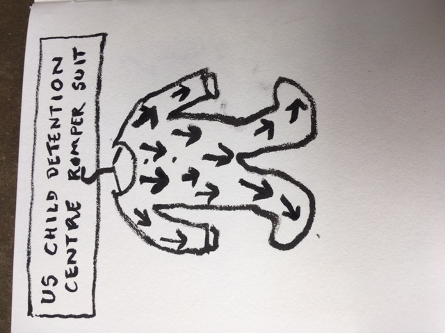
babygrow
July 5th, 2018
July 5th, 2018
July 5th, 2018
I
July 5th, 2018
The Hungarian news imagers – back then
July 5th, 2018
Hello everyone,
hope you will like the new and updated cK website :)
(more on the major change of the ‘who’ page, ‘how to publish your posts’ and ‘posting via email’ in separate posts)
While this is a design refresh rather than a re-design, I thought I write up some notes on my thinking behind the edits and changes. And of course, ready to edit and tweak one and all following your feedback :)
As JohnW pointed out – a serious update to the site in terms of content would take some in-depth consideration, planning and review and so I’ve left all content in place, only reshuffling Tim’s work into a new category, specifically for him and his amazing work. The rest remains as it was, awaiting editorial reviews and edits as and when time and people power allow.
NOTE: we do not have a search function on the site – could you please let me know whether this should be added. At the time, it was decided that it was not needed.
The main addition to content is now the new Privacy Policy page and the cookie consent pop-up. I’ve used our text for this as placeholder of sorts – and handing over the responsibility for the final text to you, if that’s ok? — As I mentioned in my emails, I don’t think I am the right person to write this text or presume to know what’s needed for cK.
In line with the GDPR and the aim of showing all needed info, for legalities, as much as accessibility and SEO – the site now has 3 new pages:
There is also an addition of two new sections – I’d appreciate suggestions for better names!
(see more info in ‘posting via email’ post)
The main focus was on bringing this now 10-year-old design up to date, making it responsive and freshen it up with typesetting tweaks and use of colour. We kept the main aspects for the update, hopefully a nice evolution to a fresher design.
For this update, I wanted to add something fresh and fun, something to add visual interest to the very white pages currently shown. The logo (to my eyes) still works very well – modern, clean and timeless – so I decided to make more use of the dynamic of the lines, angles and curves by integrating the logo as large faded version as backdrop to the webpages.
This faded version of the logo as background will scale to the size of the window, showing the graphic at varying sizes across the different pages, at times in full, or cut off – all depending on page size. This will form different patterns, align dynamically in different ways with the various content elements yet remain only a subtle backdrop.
I realise that this will be something some of you might like with its randomness while some of you might dislike it for that very reason. Can all be edited and changed, of course.
Ok, I think this is it for now… phew :) Apologies for giving you all so much to read through… this small update grew a little more complex but hopefully for the better. We’ve tested it all and hopefully ironed out any display errors etc – but please do let me know if you find anything wrong. And I would appreciate your thoughts and comments, good and bad. Happy to tweak anything you all feel should be tweaked/changed/edited, please let me know.
July 5th, 2018
July 5th, 2018
July 4th, 2018

July 4th, 2018
You are required to login to view this page.
July 4th, 2018
You are required to login to view this page.
July 4th, 2018

Sent from my iPhone